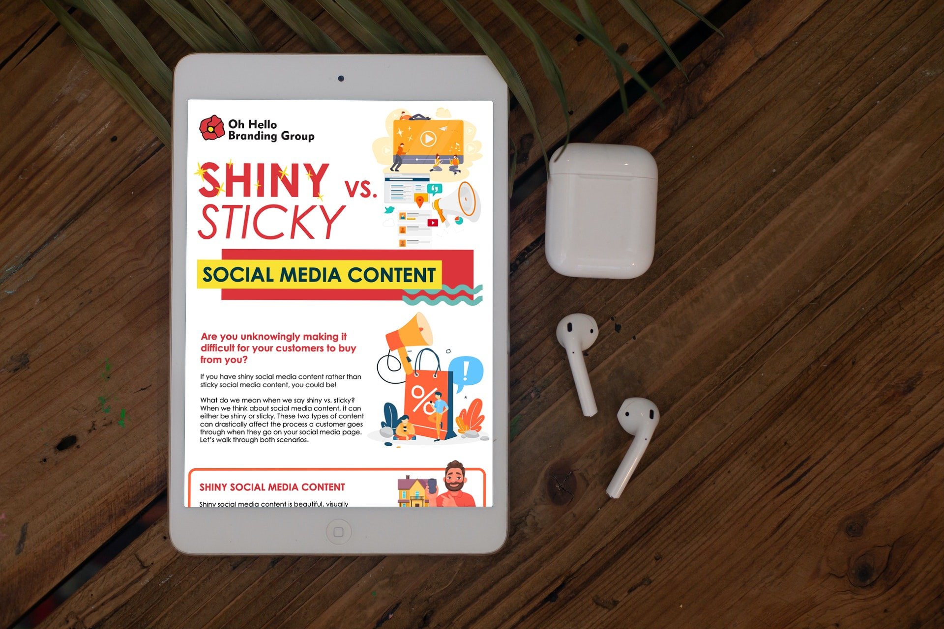
Are you unknowingly making it difficult for your customers to buy from you?
If your social media content is shiny rather than sticky, you could be!
Watch the video below to learn more about how to make sure your social media content "sticks" prospects to your page and creates a clear path to get in touch with you or buy from you:
What do we mean when we say shiny vs. sticky? When we think about social media content, it can either be shiny or sticky. These two types of content can drastically affect the process a customer goes through when they go on your social media page. Let’s walk through both scenarios.
SHINY SOCIAL MEDIA CONTENT
Shiny social media content is beautiful, visually pleasing, cohesive, and plays into a strong brand identity. This type of content signals that this is a successful business. But shiny social media content only gets you so far. So let’s imagine a prospect is looking at a shiny Instagram account for a home builder. This is the process they will go through:
- Google home builder near me
- Click on their Instagram profile
- Be initially pleased with the beautiful, cohesive Instagram feed
- Click on one of the photos
- See a photo of a stunning home, with a caption that describes the home but does not give the prospect any next steps or further information
- Be curious for more information on this home builder
- Click on more beautiful photos of houses, with captions that only describe the photo, and give no action steps
- Be curious about a kitchen design that they LOVE from this home builder
- Click on the photo of the kitchen, only to find the caption “Look at this beautiful kitchen!” with no clear action steps on how that customer can make that kitchen in the photo their own
- Get frustrated and search around the Instagram profile for more information
- Click on the builder’s website in their Instagram bio
- Click around the website, which has an amazing SHINY design, but only has links to browse floor plans
- Get annoyed that there is no “warm up”, they were looking for more information on that kitchen design or information on where you even start when you are curious about the home building process
- Get confused by the website as there is no clear path for someone who does not know much about home building, BUT was ready to discuss possibly building their own home
- Click on links to floor plans, the home building process, builder trends and gets confused by all this different content
- Gets frustrated and overwhelmed and finds another home builder
STICKY SOCIAL MEDIA CONTENT
Sticky social media content is still visually pleasing to the eye and “shiny”, but it has a “stick”. It keeps the prospect interested in the content and guides them through the next step. It also tells them exactly where to go if they want more information, and has content for everyone no matter what step in the process they are in. Let’s imagine a prospect is looking at a sticky Instagram account for a home builder. This is the process that they will go through:
- Google home builder near me
- Click on their Instagram profile
- Be initially pleased with the beautiful, cohesive Instagram feed
- Click on one of the photos
- See a photo of a stunning home, with a caption that describes the home in the picture with “Link in bio!” attached at the end so they know exactly where to go for more information on the photo that caught their eye
- Click the link in the bio
- See a wonderful link resource, which has all their photos with links laid out in an easy to browse feed
- Click on the photo they were interested in, and gets directed to the exact home they were viewing on the Instagram account
- Sees the price of that home, the features, the price range, the amenities, the location, and sees a direct link to speak with someone from this home builder
- Gets excited because they found their dream home style, immediately clicks the “Contact Us” button and sets up a consultation
Do you notice how both prospects went through the same initial steps, but the sticky Instagram profile put the prospect on a direct path to get more information about the content they were interested in and get in contact with the builder? That was immensely easier than viewing a bunch of photos, clicking around on a website with no clear call to action or information, and having to redo the process all over again. THIS is the difference between shiny vs. sticky social media content. Both are “shiny” and beautiful, but the sticky social media gets the prospect directly to you and takes all the unnecessary steps out of it.

Make sure your social media content makes it as easy as possible for prospects to buy from you with our free Shiny vs. Sticky infographic.
Just click the button below to download it directly and you can always refer back to it!
And if you would to discuss how to improve your social media strategy with a real person, get in touch with us for a free 30 minute social media strategy consultation.
